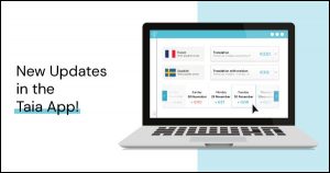
With a new user interface, an easier login process and project management features which are more intuitive and simple overall, your Taia experience will be more simple and user-friendly than ever before.
What’s the news from Taia-Land?
This year it’s not just about the Christmas songs, as Taia is entering this Christmas season with a bang. So buckle up, because we are super excited to give you an overview of what’s new and why we have decided to go with these changes.
We have decided to rely first and foremost on our clients’ feedback, as we’ve tried to identify the most pressing issues they have encountered while using our platform. As simple-to-use and intuitive as it was, we’ve made it even more so by taking into account your comments and opinions. This update is not something that happened overnight. It is a result of a long process to which we devoted a tremendous amount of time and resources. We are really excited about it, as we are positive that it will make your life much easier. Without any further ado, let’s take a look at what’s new!
A new and improved platform
To start things off, we have completely revamped the user interface, making it even simpler to navigate by getting rid of some of the excess information that could previously throw people off a bit or even slow down the process. We have also unified and synchronized our color scheme throughout the Taia platform – here you can see it in all its glory. We have simplified the Sign-Up and Log-In process too, so instead of having to go through the tedious task of scrutinizing images of some traffic lights to prove that you are in fact an actual human being, this process now unfolds automatically, much to everyone’s delight.
With that first obstacle out of the way for good, let’s move on to the good stuff. You will now be able to draft your projects in a more comprehensive way, as the service selection page has been broken down into several steps. This enables the user to easily track what they’re doing and focus more easily on individual steps in the procedure of ordering a translation service. Simple gets the job done!
Manage your projects like a seasoned pro
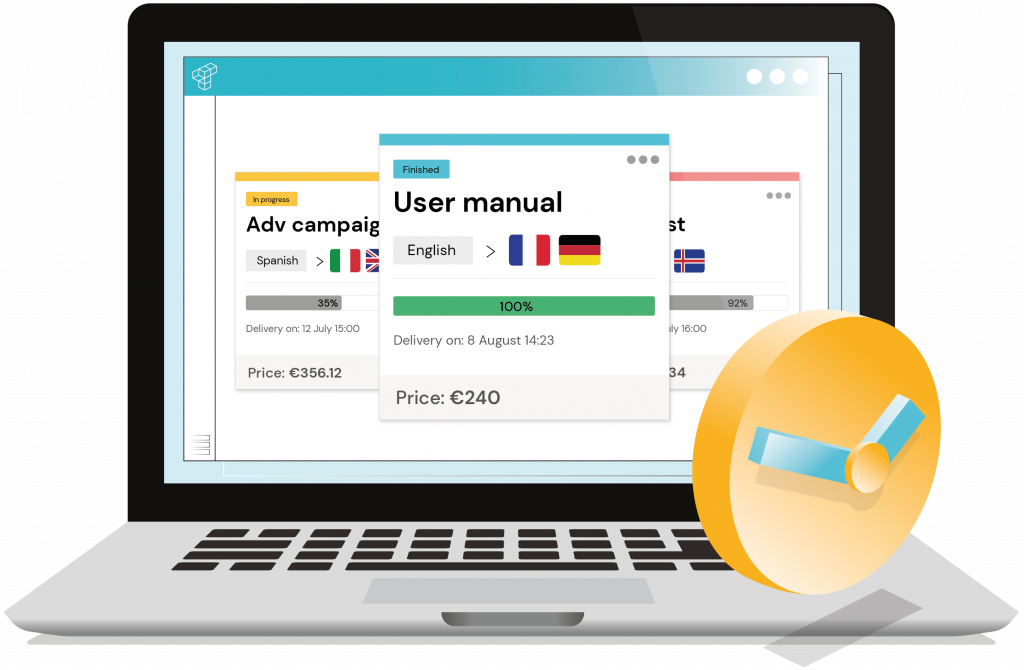
The “Projects” tab has been freshened up to reflect the driving force behind this update – unmatched simplicity and user-friendliness. Here you can get an immediate overview of all your projects and filter them through an array of different options. But in order to admire your neat and tidy list of projects, we have to create some projects first, wouldn’t you agree?
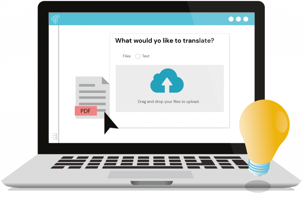
Creating a new project has really never been easier. We have streamlined the previous interface by preserving only the essential features you need to efficiently submit your projects, whether you want to outsource them to us or translate them yourself. The process itself is an absolute cakewalk! Choose what you want done with your project, select the source and target languages, drop your file or text and pick the category that best suits your project. All done.
Order your projects more smoothly than ever
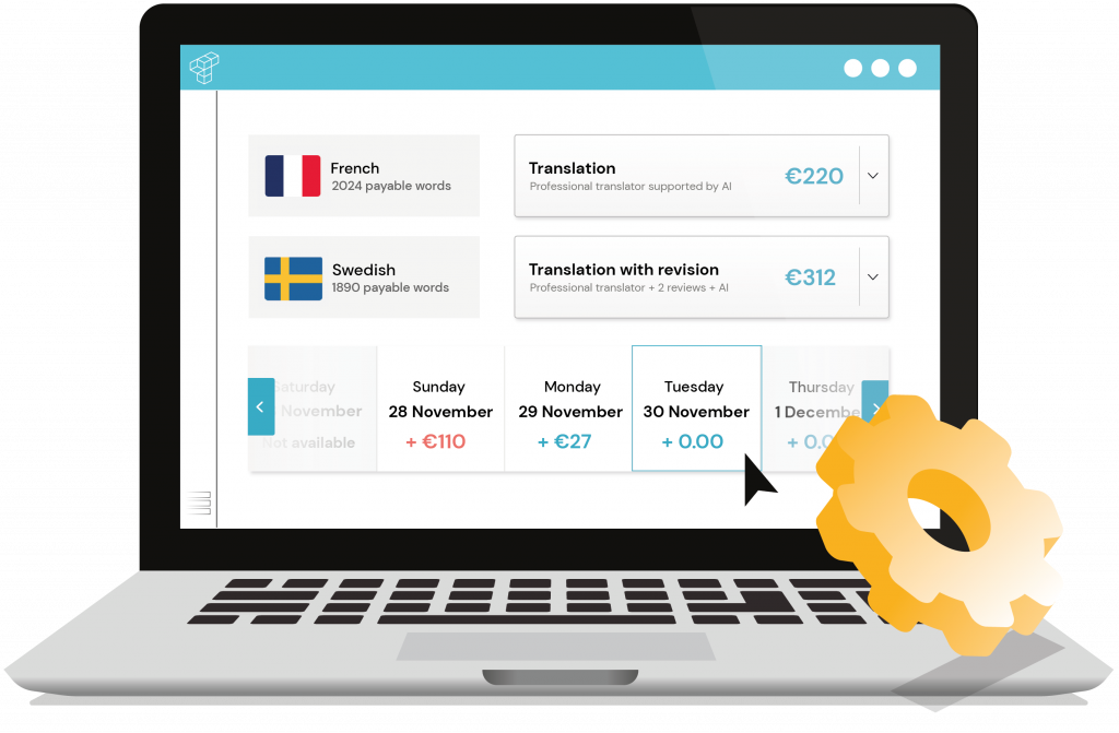
The project ordering process is now drastically more intuitive. We have replaced the eyesore of different buttons and sliders with an extremely simple interface that will seamlessly guide you to success. Choose one of the services we offer and select your preferred delivery date. That’s it. Even the pricing is more transparent than before. But now, allow us to touch again on the overhauled delivery deadline system, as it is one of the most important innovations of this update.
We have completely revamped our delivery date interface. To give you more flexibility, you can now choose a specific delivery date, so you know exactly when your project is going to be delivered. You can now also select an earlier delivery date, just in case your project is more urgent. The level of transparency when ordering a project has really never been higher!
Everything in one place
To further elaborate on our previous point, we have made the distinction between ordering translations and doing your own translations (with Catapult) even more obvious. This change was long overdue due to the fact that our users would occasionally find it difficult to know exactly what kind of service they are signing up for. Now you can organize your work more efficiently and find the perfect balance between the tasks you want to carry out yourself and the tasks you would like to outsource.
Refined company management tools
With the help of user feedback, we have unified the company management interface, which is now fully synchronized with the rest of the platform. Be it for companies or individuals, the new and improved “My Teams” tab allows you to add new members to your team or manage existing ones in a very straightforward way.
Nothing has changed in terms of functionality; the differences are purely cosmetic in nature. We have significantly reduced the amount of redundant information and aligned both company management tabs so that every action feels natural and instinctive, no matter which company management tab you are working in.
Sit back and enjoy the ride
To be honest, life has never been easier for Taia users. By following up on your needs and wishes, we have been able to enhance our platform even further to make it as user-friendly and intuitive as possible. That being said, we always strive for perfection, therefore your feedback will continue to be as invaluable as ever. Don’t hesitate to share your experience with us and we will make sure to follow up on it as soon as possible. Now, stop wasting precious time and try out our new platform here!
Liked this content?
Get notified when we publish something similar.
* We don’t spam your email or share it with anyone!
tell us what you think about it!

